.svg)
Creating the second generation of Optimizely multi-product design system - Axiom V2.

I led the design of Axiom V2, defining long-term goals, addressing technical constraints, and creating reusable components, documentation, and guidelines. I also coordinated contributions from the product design team.
As the sole designer on the design system team, I worked closely with three developers from the project's start to ensure alignment between design and implementation.
The Axiom Design System at Optimizely was established over six years ago, becoming a key reference for multiple products, including acquired ones.
Over time, as we evaluated the system’s efficiency and overall health, we gathered mixed feedback on its visual design and identified growing technical debt, leading to inefficiencies for designers and developers. Adoption challenges also made aligning with Optimizely One vision challenging, emphasizing the need for a comprehensive overhaul.
To support the company’s new vision, we initiated a full-scale revamp focused on creating a cohesive look and feel, enhancing usability and improving efficiency. All without compromising on performance or accessibility.
Research indicates our products feel flat, dated, and enterprise & sterile, lacking a modern and engaging aesthetic.
Inconsistency across products complicates maintaining brand standards and company vision.
Foundations and components fail to meet AA compliance standards.
The UI library and components are not adaptable enough to support the needs of eight products.
%20(12).png)
and GIST (Goals, Ideas, Step-Projects, and Tasks) planning and prioritisation methodology.
Reimagine the design system to improve visual identity, increase product team engagement, and strengthen product positioning as an elegant, comprehensive, and fully integrated experience.
To accomplish this, we established the following priorities:
The design system should deliver a visually appealing experience that encourages adoption and enhances user engagement.
The design system can handle increasing complexity and scale without degrading performance.
The design system should be inclusive and compliant with accessibility standards, ensuring a seamless experience for all users.
To better understand the recurrent problems in product development at Akveo, we conducted interviews with stakeholders from different departments, including: Designers, Front End Developers, Product Managers and Marketing Managers.
After the initial interviews, we analysed the key concerns and further narrowed the goals of our research, which were:
We started by auditing a wide range of products and platforms from our portfolio, paying particular attention to projects that had to be redesigned and projects developed following Lean design
In the absence of guidelines and a defined element hierarchy, almost all products had numerous inconsistencies, like different hex codes for practically identical colors as well as different shapes and strokes. Most importantly, we found many inconsistencies in terms of component styles across products and platforms.
All these aspects have significant detrimental effects on the overall user experience and brand image.
Investigating the team’s requests, concentrating on those that could increase performance and facilitate maintaining consistently high quality.
Designers working on a project without a library of components have to do repetitive work to create each new screen. This also applies to the implementation, since developers would have to spend more time creating new components from scratch. Should a brand request a seemingly small change like updating the color of an action button, this requires significant effort–and time–from all teams involved.
There was no button hierarchy or a clear structure for the different components used across platforms. This made maintaining a consistent visual style and architecture across all platforms complicated, time-consuming, and expensive. On top of this, onboarding new team members to the fine detail of a given project ate up resources unnecessarily.
Weeks pass from the beginning of projects until clients can see how the product looks and feels, and then months more pass until the product is actually ready to use.
Explored the most successful design systems, and uncovered some common patterns and principles, of which we chose 3 that addressed our needs as the pillars of our Eva design system.
The design system should have a consistent structure, hierarchy, and guidelines. It needs to share a single design language and a set of libraries that helps reuse existing designs, code-bases and facilitates collaborating efficiently.
The system’s modularity ensures maximum flexibility in execution. Its components are designed to integrate seamlessly in any combination that responds to a given user’s needs across platforms.
Given that the product is aimed at a large, diverse user base, it must respond to the needs of various kinds of users. These include states and statuses that facilitate the use of assistive technologies by those with visual, auditory, and motor impairments, to create inclusive experiences.
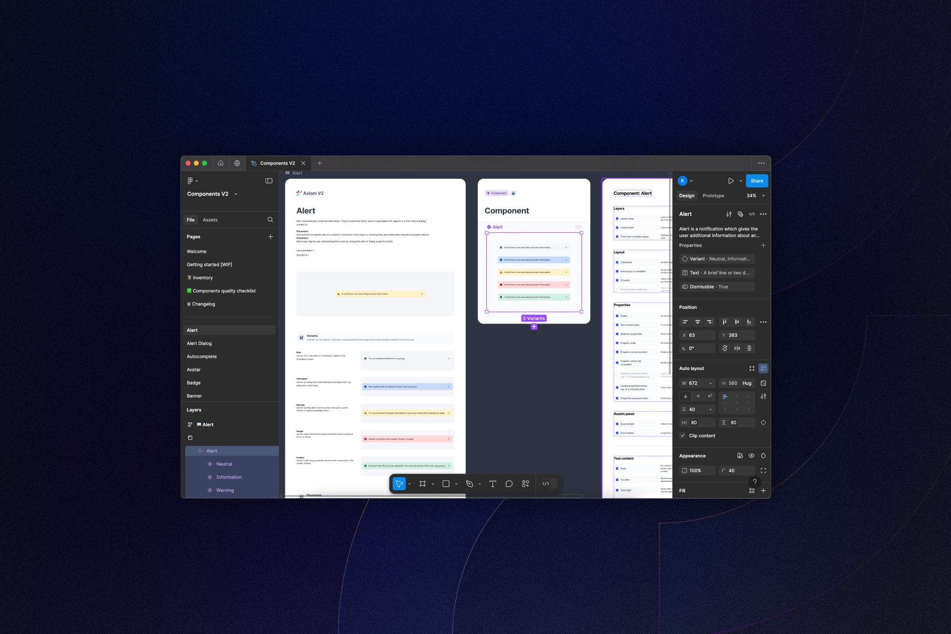
My team and I followed these steps to keep priorities and scope on track to maintain clarity and bring the Axiom V2 to life.
We audited the token structure at both the design and code levels, proposing a new, more intuitive semantic structure. This reorganization accommodated the complexity of over 40 components, making the system more user-friendly.
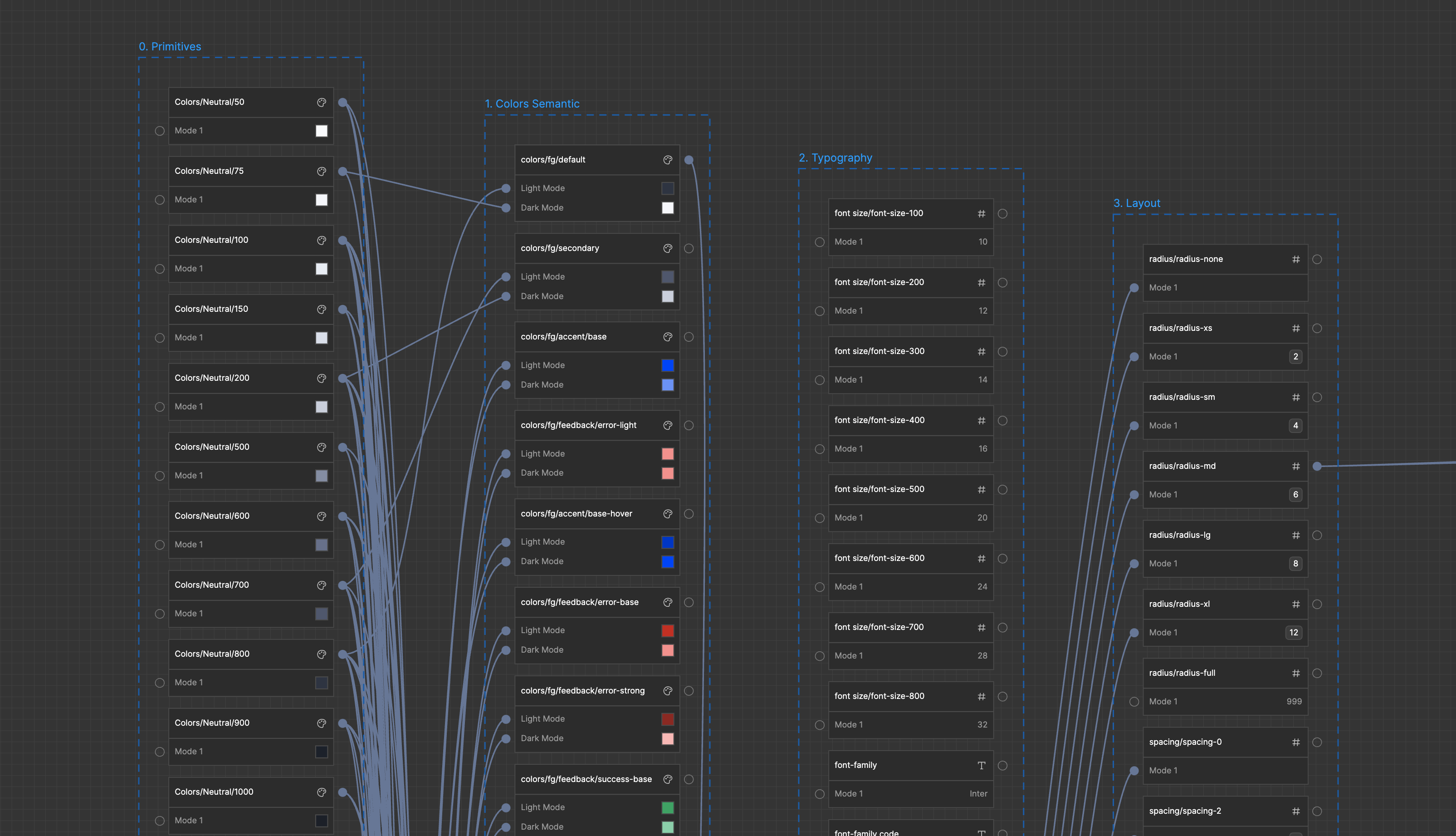
Reusable colors, typography, spacing, and components are essential for a consistent and predictable experience for both product teams and users. To promote reusability, I focused on making the system intuitive, flexible, and modular—allowing designers to adapt components to improve the user experience while maintaining visual consistency.
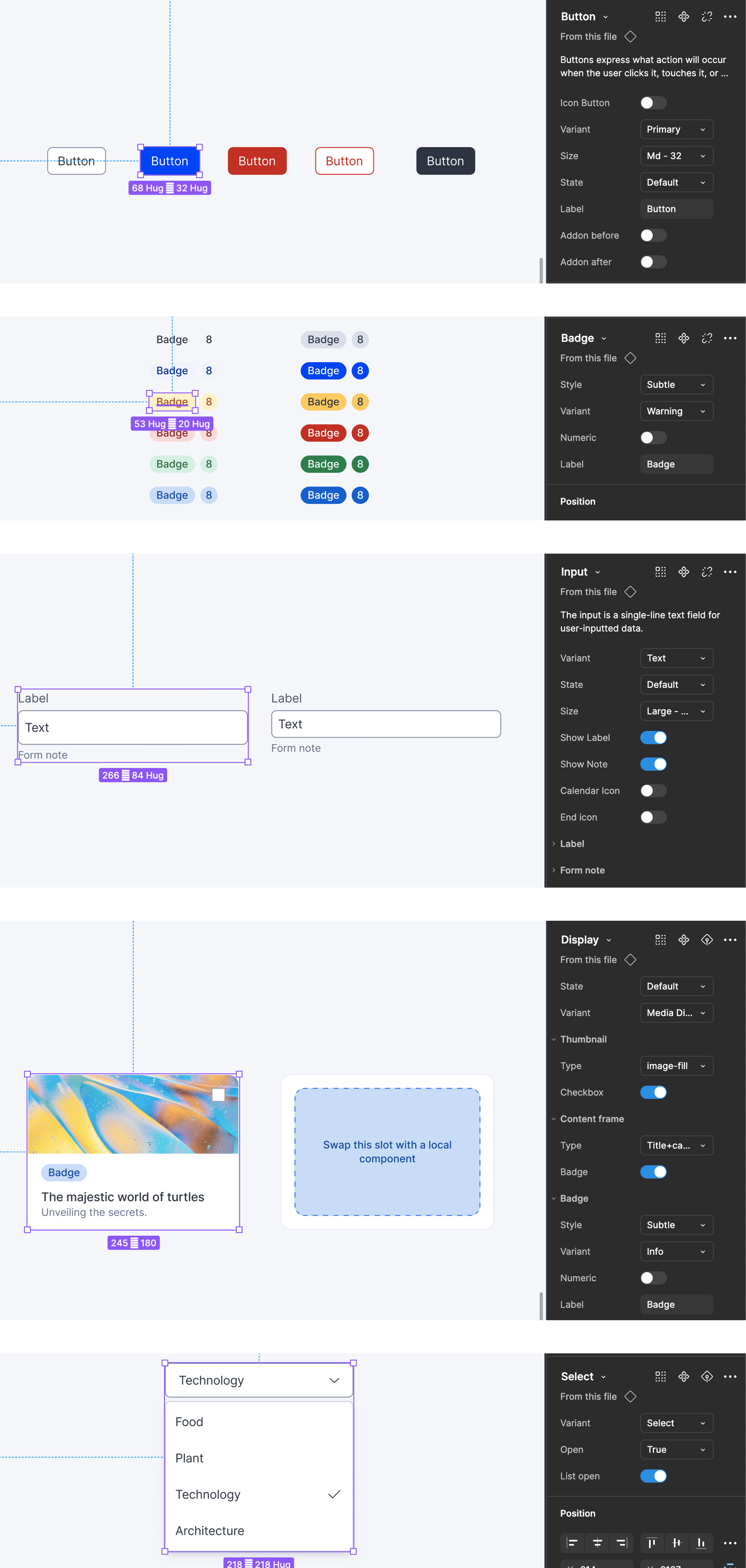
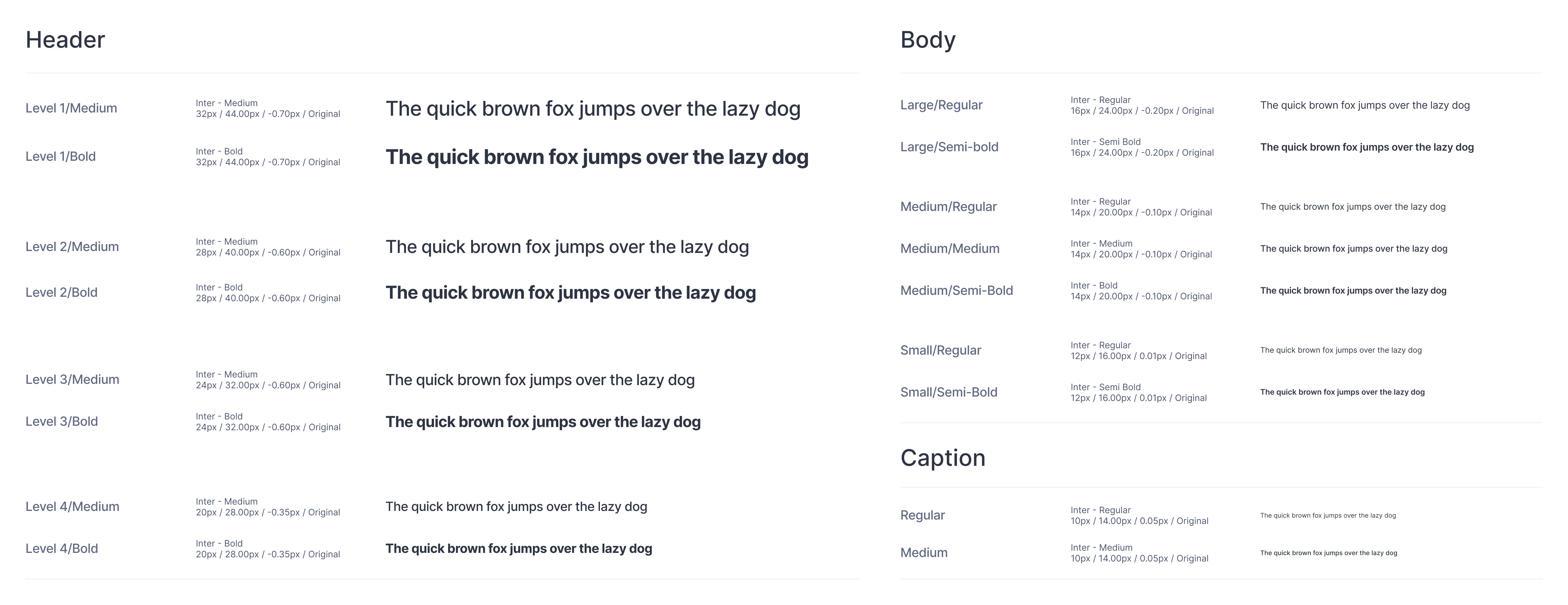
To validate the impact of the new design system, I refactored several existing product screens. Our study showed that a refined visual language enhances products and received strong support from product teams.
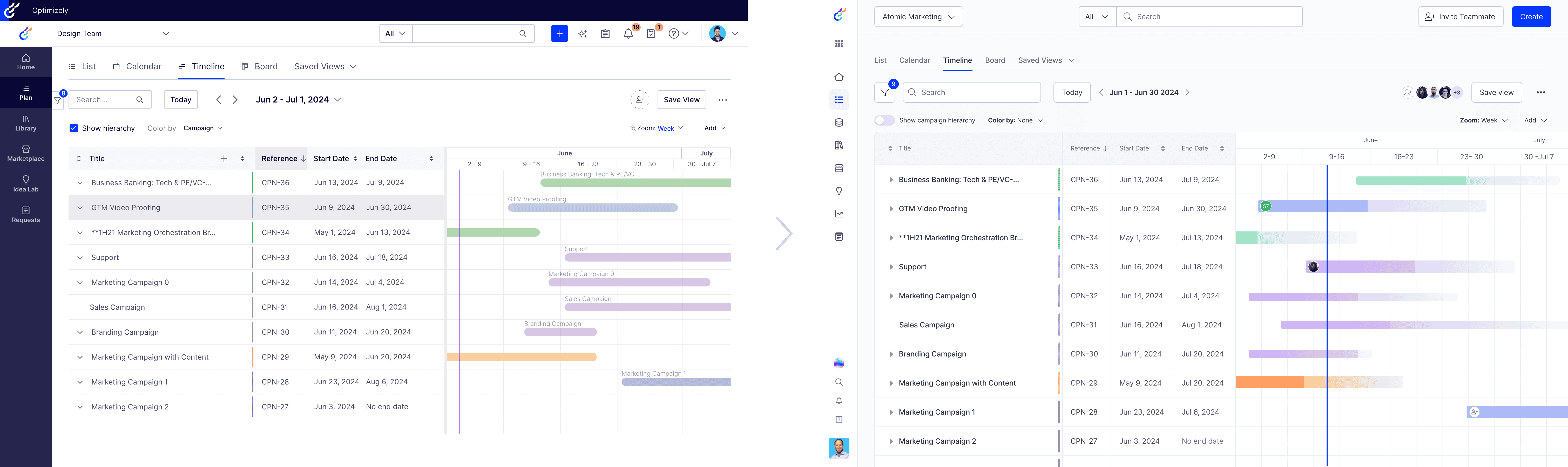
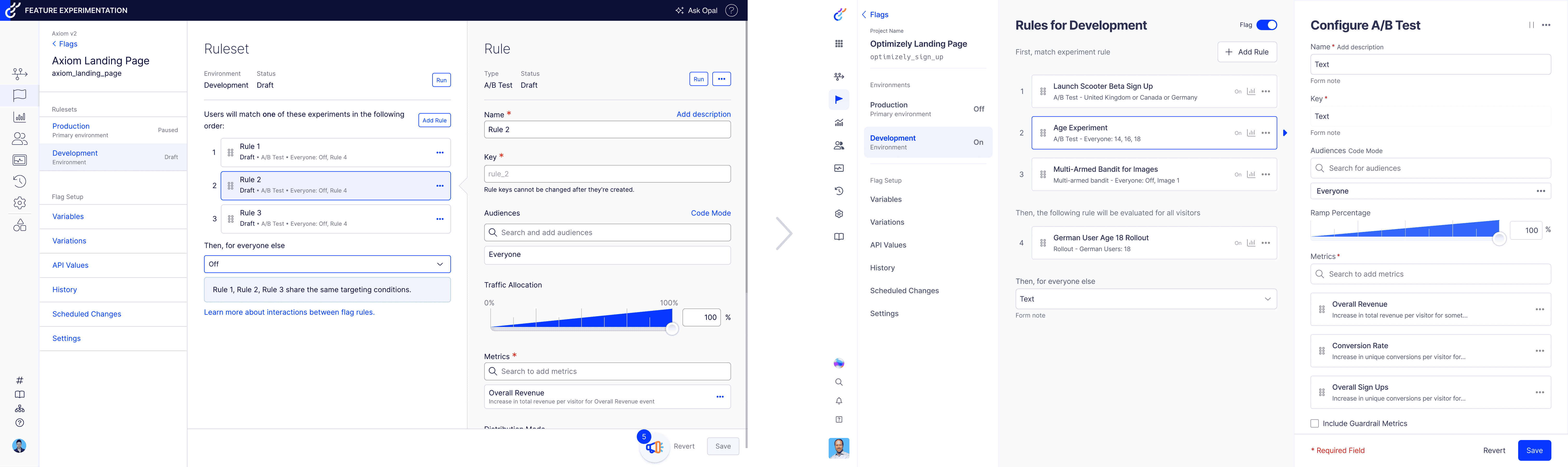
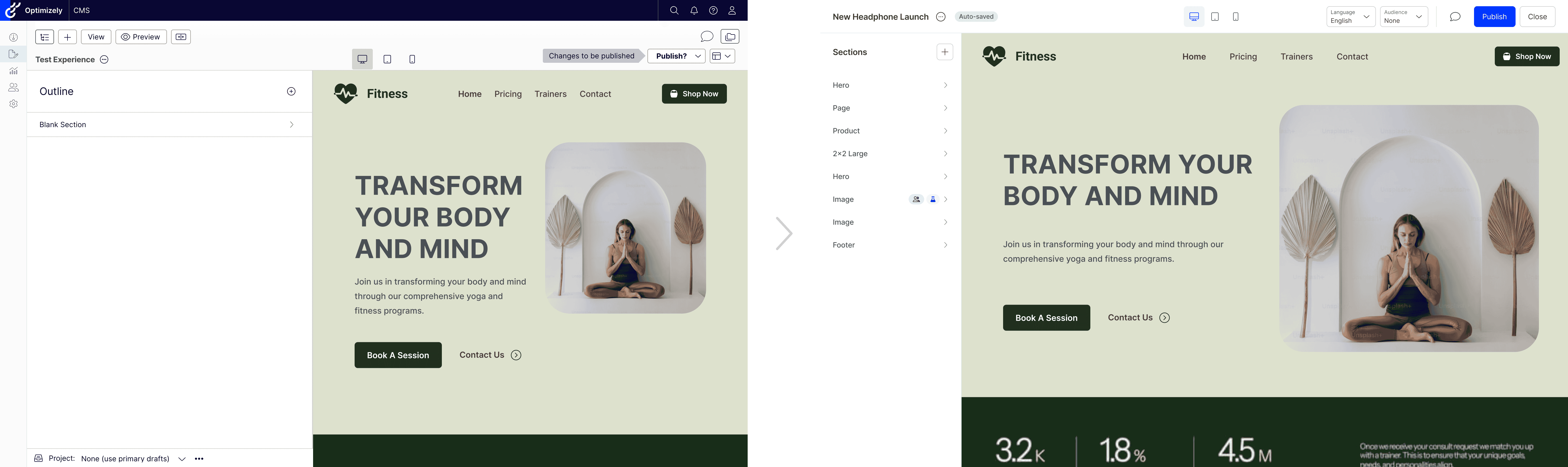
Dark Mode was one of the most requested features. While refactoring the token system, I saw an opportunity to introduce it, even though it wasn’t a top priority initially.
It became a strong point in driving adoption and engaging the product team.
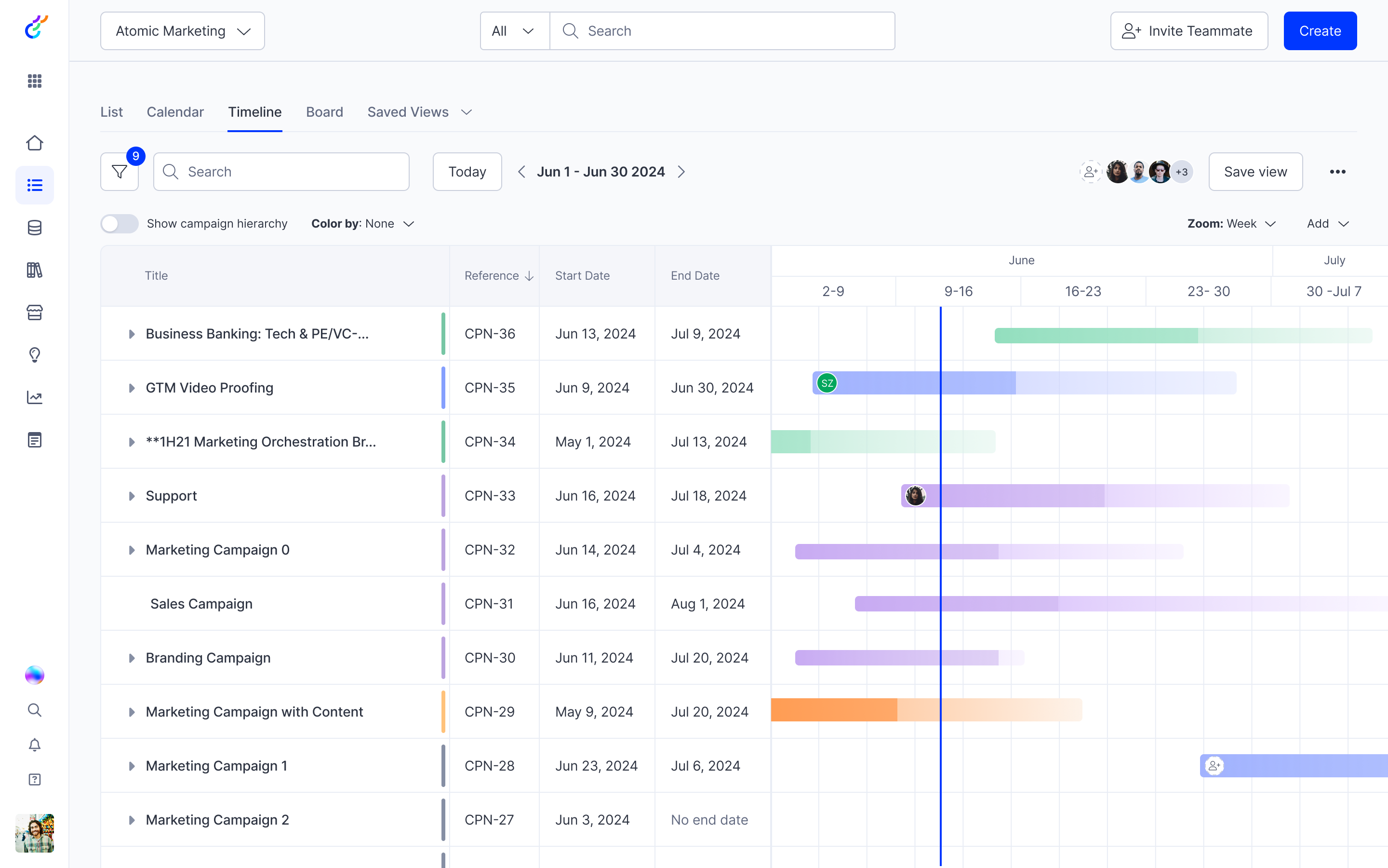
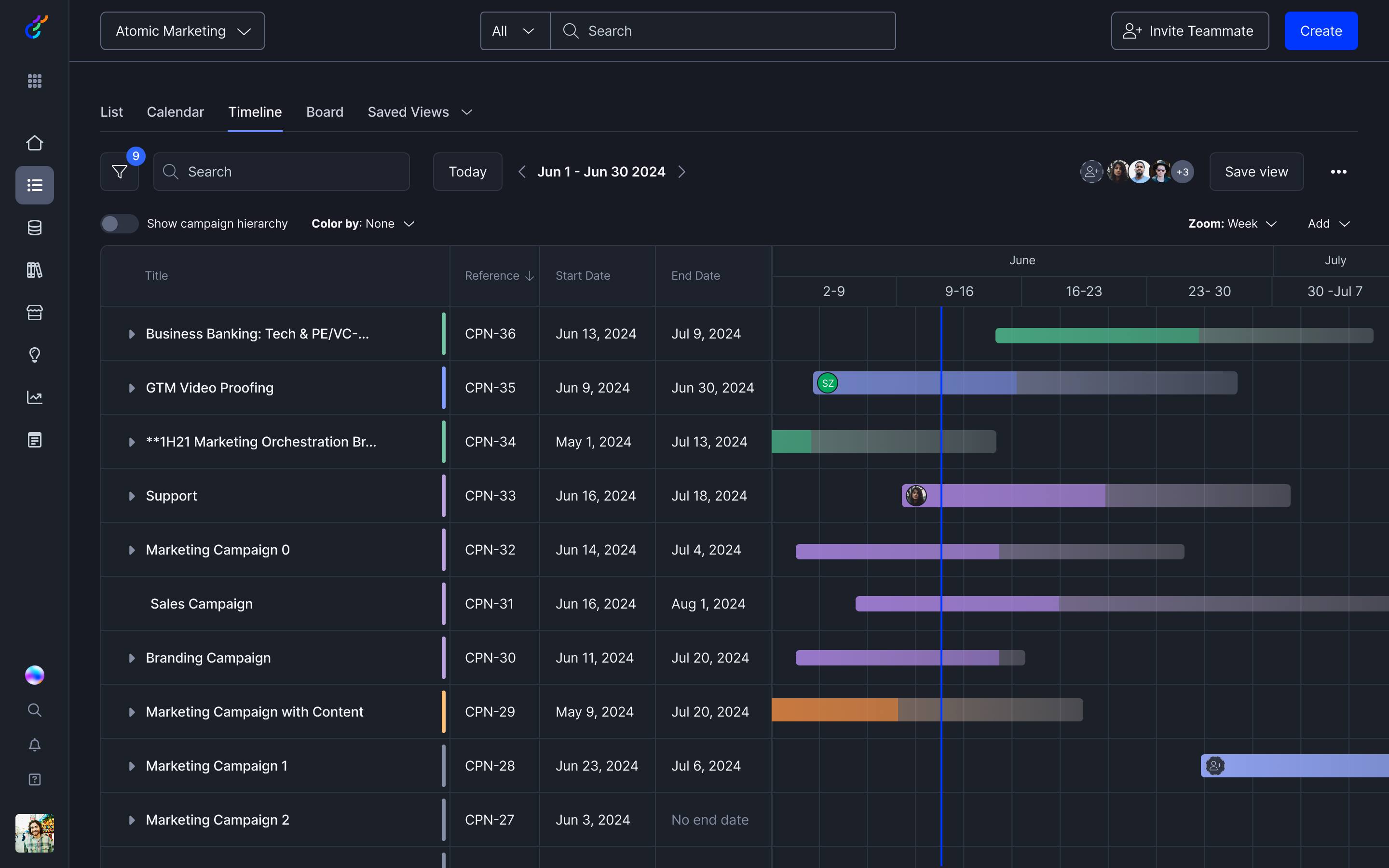
While Axiom V2 is still in active adoption, it has already received highly positive feedback from product teams. Early adopters reported a significant reduction in time and effort when refactoring old designs and developing new features. Easily configurable, accessible components have also streamlined design reviews and minimized inconsistencies.


